Wednesday, March 24, 2010

critque me


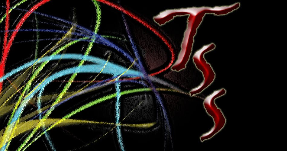
this is a design i made for one of my shirts on cafe press, i wanted to make kind of a crazy urban look that has no sense doesnt mean anything. i came to conclusuion that i was going to make somthing that everyone would like due to the style bright colors shapes that dont go in order and kind of messey looking for example the form of the images arent vary straight this is what i am going for within this design. for the most part this is what ive been doing with all of myshirts using the lasso tool and making crazyy diesgns
Monday, March 22, 2010

update me

helllo everyone,
for today im going to work on some more logos for my cafee press, all of my logos have turned out better then i thought. over the past weekend i havent really thought about what im going to do for this project its pretty much standard come to me and ill try it out. i have done things outside of photo like hang out with friends and im going to visit the university of iowa this thursday im pretty excited to see the campus i heard it is really nice, i plan to contiue my career in photo while im up there

Wednesday, March 17, 2010

critque me


i took this picture of a barn for my last project i thought it was a intresting project. i am always into taking pictures of myterous places that are really creepy. i also like how there are diffrent colors in the image even though it is black and white you can see where all of the color would be int he pictures by the light and dark spots within the whole thing. also how there is a fade in the opening part it gets dark then gets lighter and you can see a post.

Monday, March 15, 2010

update me

this weekend was a avry long weekend with no many nice days, i didnt get to go out and shoot because of these conditions. now in classwe are going to make our cafe shop were we are going to make are design and make a logo to our liking. im excited to see how my company is going to work out and what kinds of things cafe has to offer.

Wednesday, March 10, 2010

critique me


i decided i would mess around with my HDR program and put some pictures into it, this is one of the picture i came up with. i like this picture because it has a real/fake look to it, the whole picture could look like a painting at one point yet its not if you think about it. in the picture i like all of the ocmpossion of te wholoe thing theres right and darks and a glose look to them.

Monday, March 8, 2010

update me

i am currently not working on any projects. in class we are about to present our project which is the still frame movie project. i am pretty excited to see the rest of them because of all the movie covers look like they are really good. when we get our next project im hoping that it is something as good as the still frame because there wasnt any guide lines and we could be as creastive as possible.

Friday, March 5, 2010

crtique you


i lioke this picture because it has good contrast with the blacks and whites. i also like how the subject is actually looking at the camera with a confused look which makes it more dramatic. this is a picture that has to do with my movie and i think it goes well with the whole secen of my movie

Monday, March 1, 2010

update me

as of right now i am working on my on my still frame movie project it is comeing along vary well, i have formed my story togther and now am working on my cover of the movie. i like thing project alot and i think it is going to turn out well. for the most part this has been a sucess. im finishing up all of my blog stuff right bnow and soon to finish all my touch ups on my project